CREDITSJON MARIUS EVANSAVARTOCREDITSJON MARIUS EVANSAVARTOCREDITSJON MARIUS EVANSAVARTOCREDITS JON MARIUS EVANSAVARTO
CREDITSJON MARIUS EVANSAVARTOCREDITSJON MARIUS EVANSAVARTOCREDITSJON MARIUS EVANSAVARTOCREDITS JON MARIUS EVANSAVARTO
Avarto Financial Solutions are a leading supplier of outsourced credit management services right across the UK. Every year, they manage millions of accounts on behalf of their clients and are committed to being a trusted and reliable business partner. Their company ethos is, ‘Where convenient and easy financial services support today’s lifestyle. For happy users.’
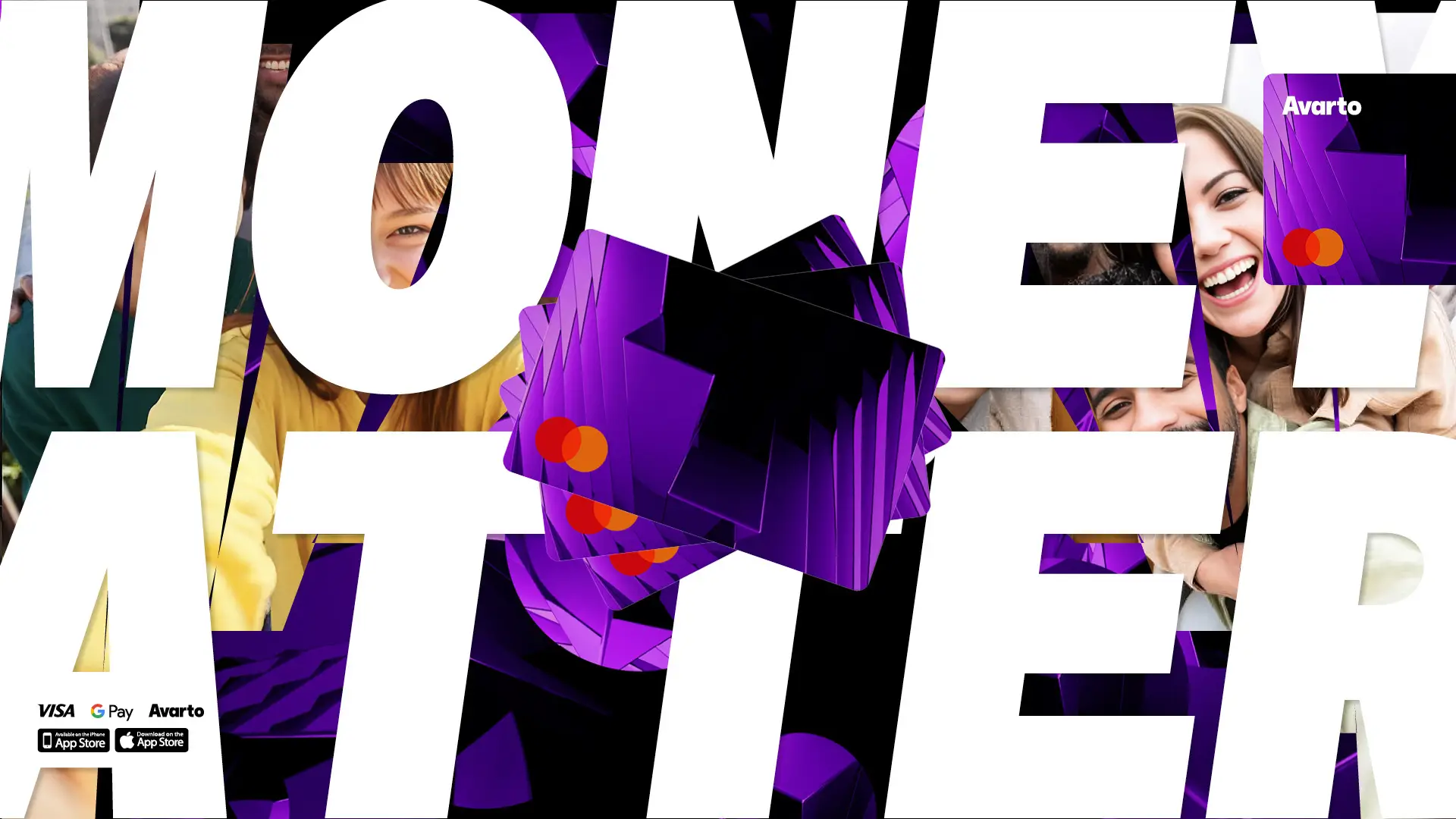
Now, Avarto have created a user-friendly app that helps you manage all of your banking and finances through one clear customer interface.
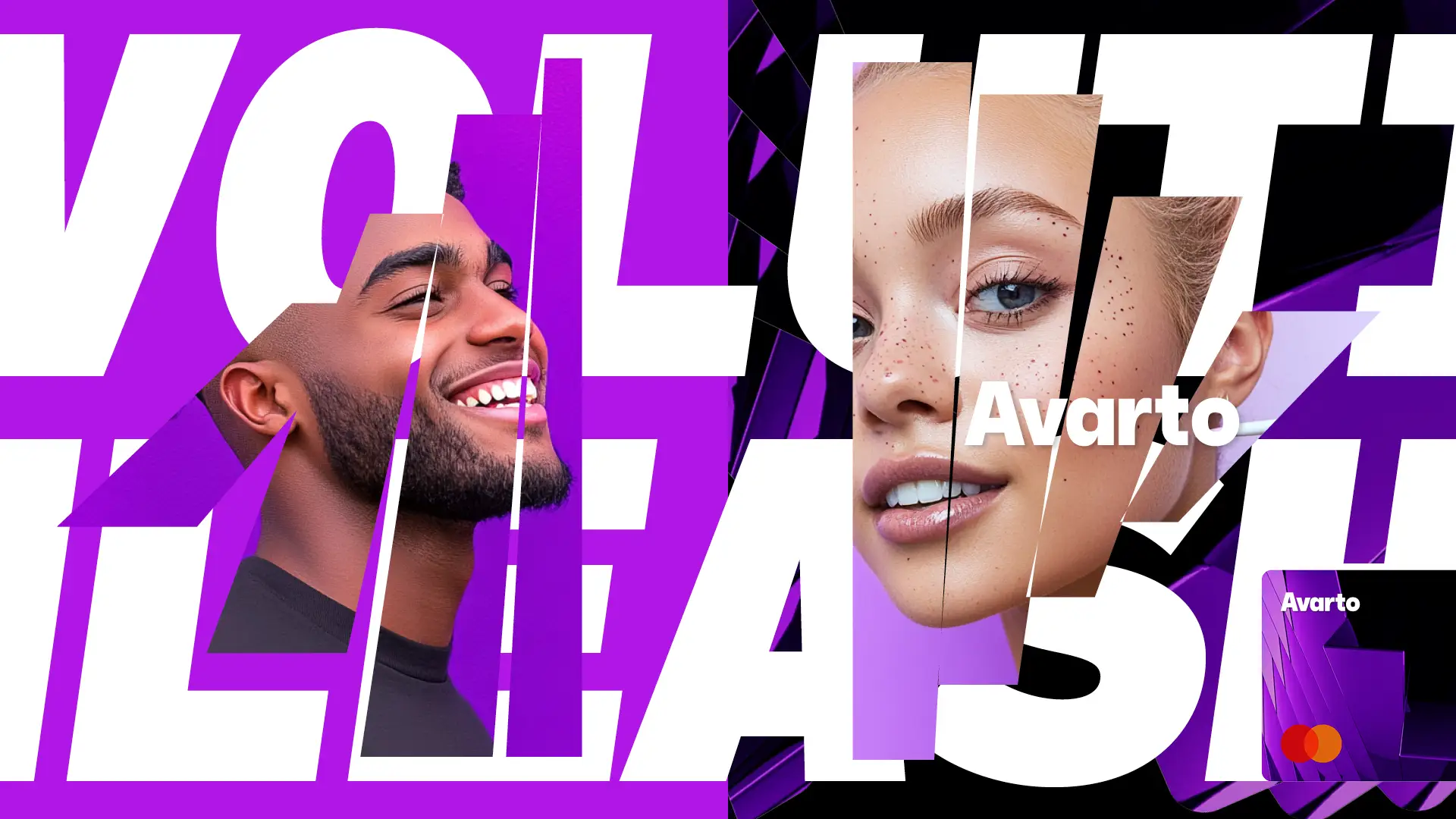
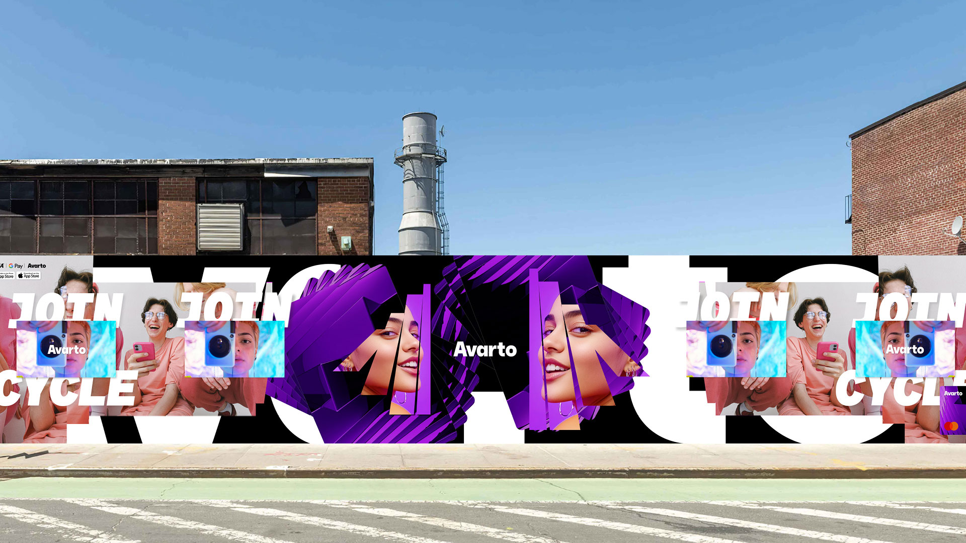
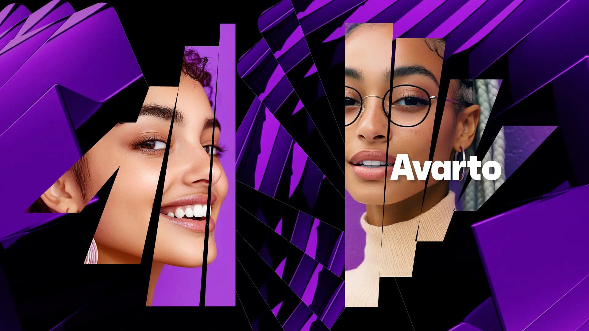
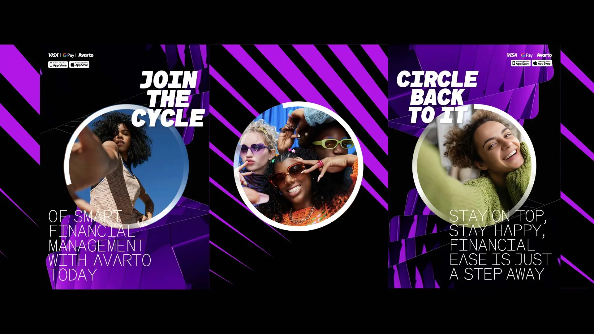
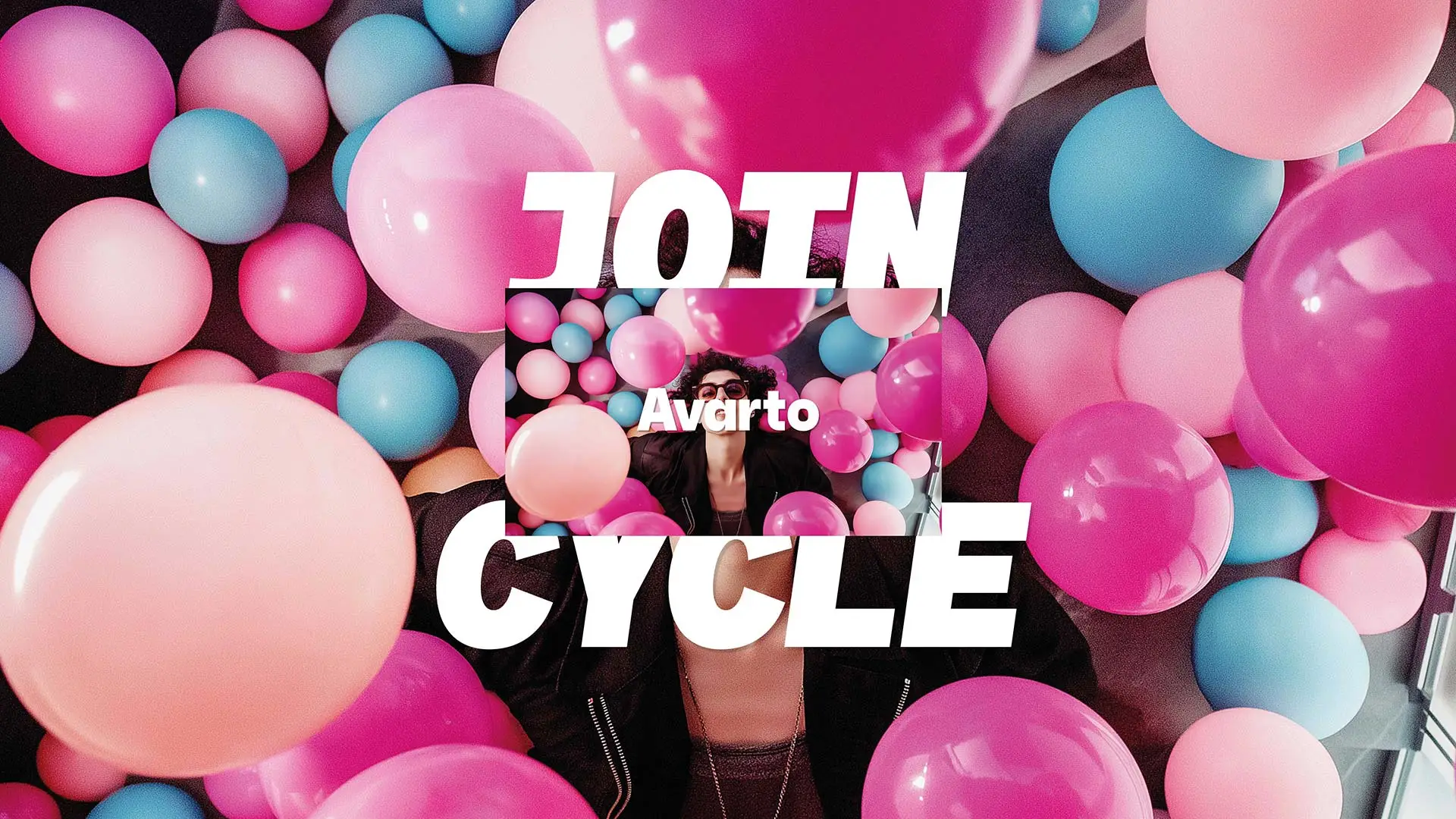
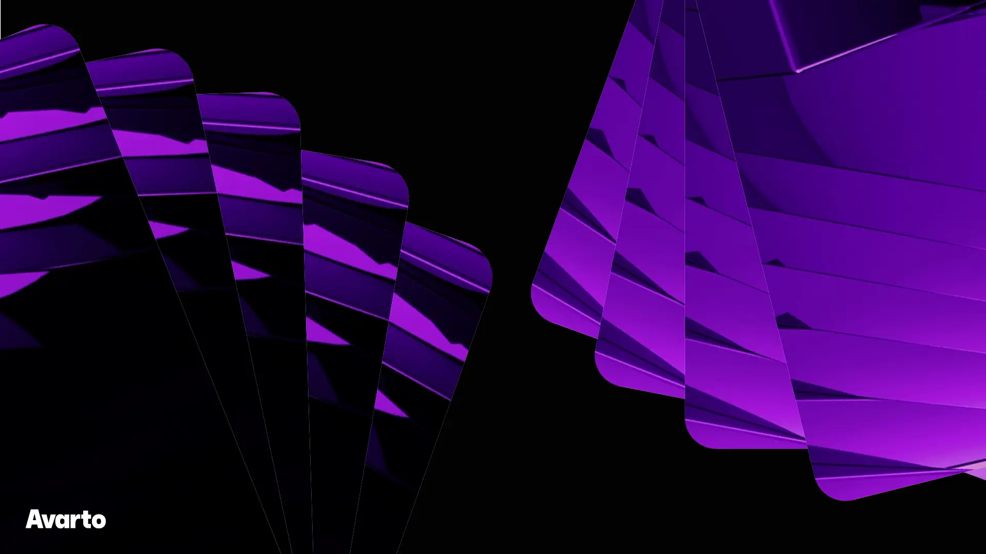
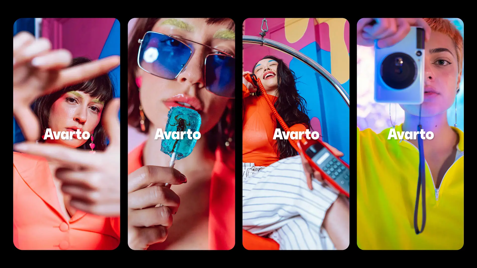
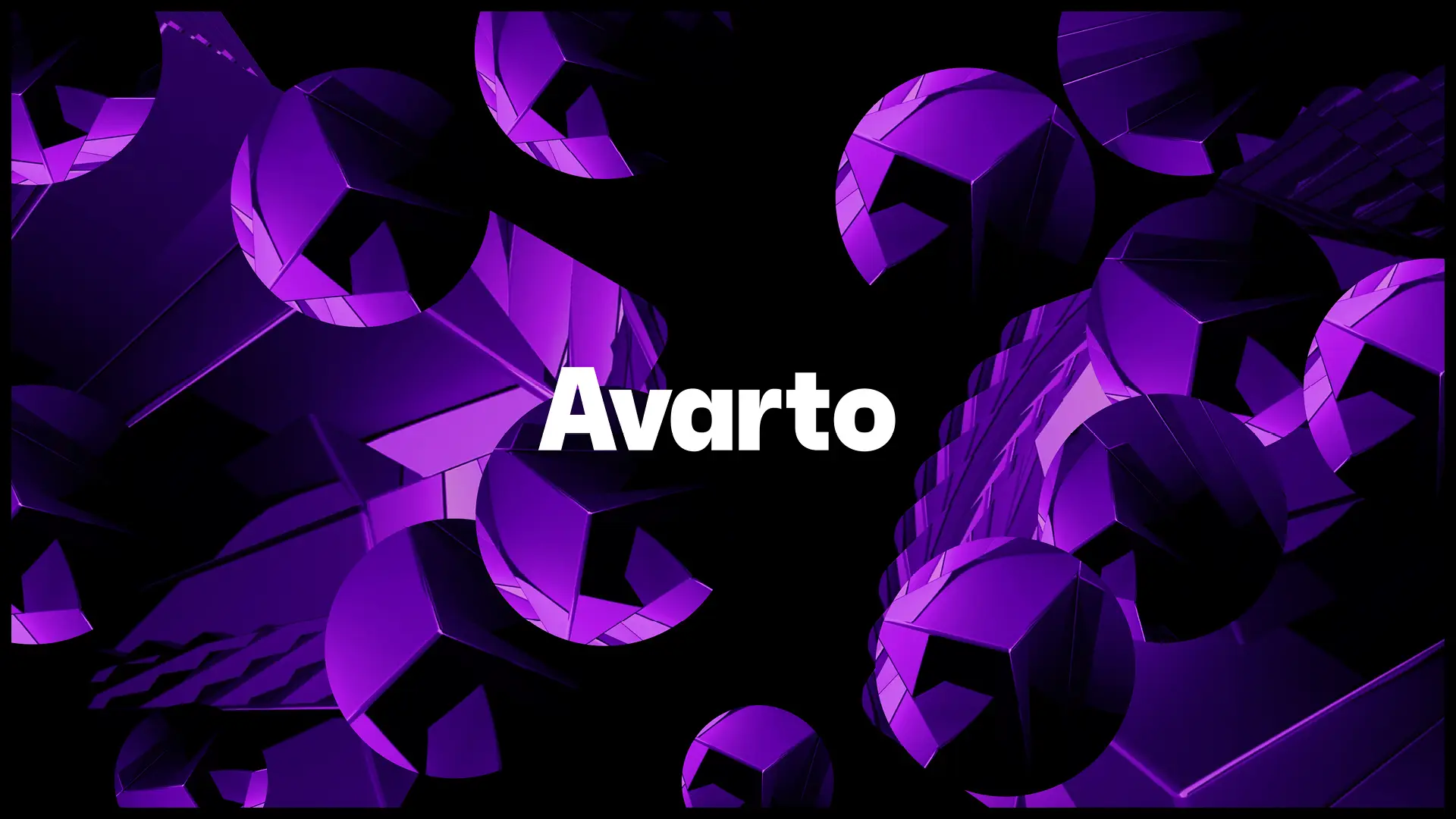
It’s dynamic, radical and ground-breaking. And so the visual identity we created had to share these same innovative qualities. Our striking design solution effortlessly communicates the efficient, seamless transaction cycle that people experience when using the new Avarto app.
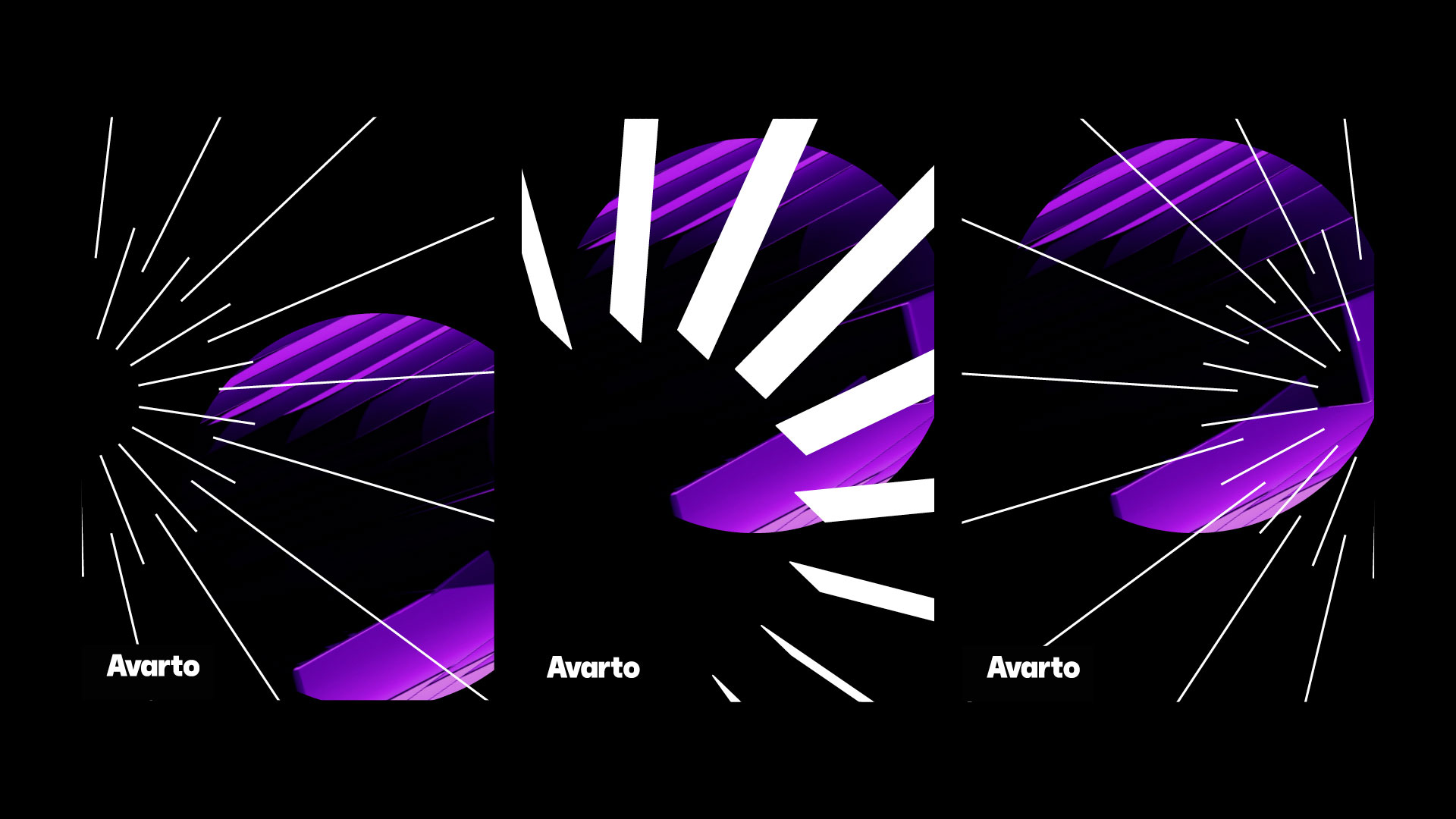
In particular, the looping video highlights the infinite, streamlined ebb and flow of finances, all brought to life by a futuristic colour palette.
All in all, our visually stunning work exudes an aura of individuality, to perfectly represent this independent fintech company which stands alone in the crowded banking app market.
DESIGN DIRECTION BRAND BUILDING VISUAL IDENTITY ART DIRECTION TYPOGRAPHY TOOL KITS DIGITAL WEB DESIGN MOOD BOARDING CAMPAIGNS GUIDELINES
I have over ten years of experience working with a diverse range of organisations, from multinational corporations to one-person startups. Additionally, I have been an integral part of a team that has collaborated extensively with clients across various sectors, including charity, education, and beverages, to name a few. Together, we have worked on numerous projects, including high-profile design initiatives for clients such as Comic Relief and Coca-Cola.
Working as an independent design consultant, I will be in control of your project at every step of the way from concept to completion. This means you benefit from a very streamlined, extremely efficient & totally hands-on working process. In addition, I can call on a carefully selected network of experts including animators, photographers and writers to collaborate on your project. Together, we can achieve the objectives you’ve set out.
“Jon is a fantastic designer, I have had the pleasure of working with for the majority of my career. Not only is he a top designer but also a great guy who always receives positive feedback from clients and constantly gets rebooked! He has a wonderful proactive attitude – I cannot recommend him enough!”
JAMES CRAWFORD
FOUNDER TALENT STUDIO
“That’s great! Thanks, Jonathan We’ll definitely be in touch if we need further design help!”
RACHEL EVANS
FOUNDER STACK FOR BUSINESS
“Honestly can’t praise more highly. Jon has been super patient and agreeable to work with despite LOTS of challenging feedback and changes on this project”
AMY BERESFORD PROJECT MANAGER
TRO
“It’s been an absolute joy working with Jon. He’s a talented designer with a keen eye for detail and a knack for delivering exactly what’s needed. His proactive nature and cheerful attitude make him a real asset to any team. We wouldn’t hesitate to have him back in the future.”
BARBARA ALTOUNYAN FOUNDER FAMILY-TALK
“The team have really loved working with him!! Hes v positive, a great guy to work with along with being quick, organised, with a good eye & can work autonomously. We’ll have him back as soon as something comes up for him!”
FORPEOPLE
“Thanks Jon, you were super.”
SHAMMI UMERIA
ASSOCIATE CD
PROPHET
“Thanks Jon – it’s been a nice one! And by the way, I thought your work was outstanding – I’ve been really impressed by your approach and ability. Hopefully we’ll work together again in the very near future.”
KATHY KIELTY CREATIVE DIRECTOR
WHISLTE JACKET
“We’ve been thoroughly impressed with Jon throughout this project. His talent as a designer is clear, but it’s his efficiency, organisation, and positive outlook that really set him apart.
SAM KEISNER FOUNDING PARTNER G010X VENTURES
CLIENTS VIA AGENCIES
PLACES I HAVE WORKED
Design Studio • W&K• Landor SuperUnion • Mother • Anomaly Dusted • Curious • VCCP • Protein forpeople • TRO