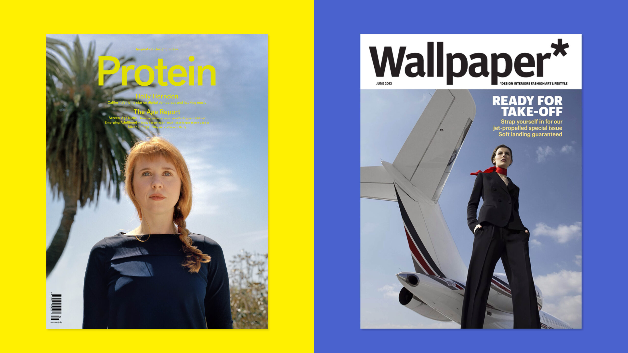
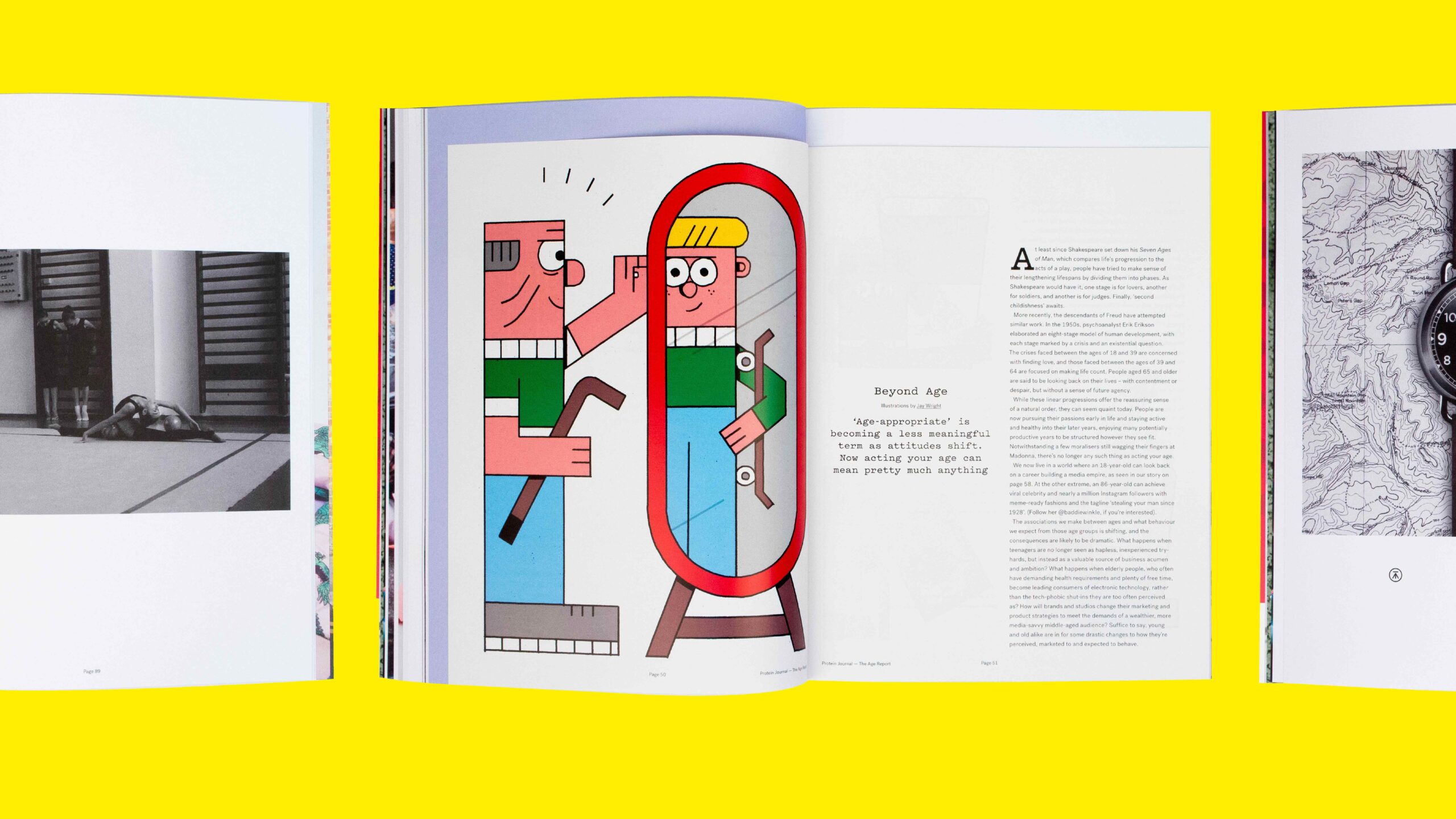
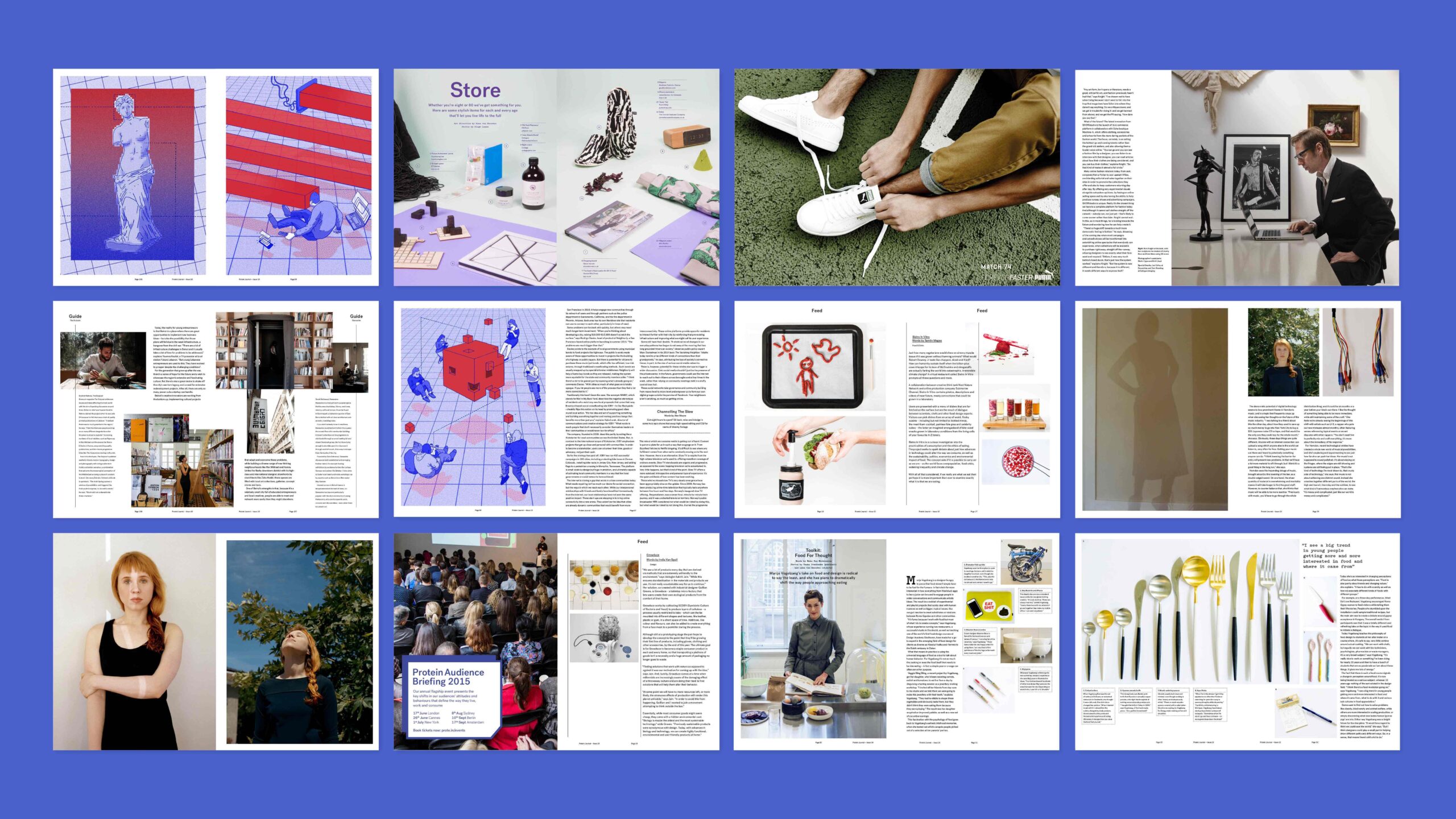
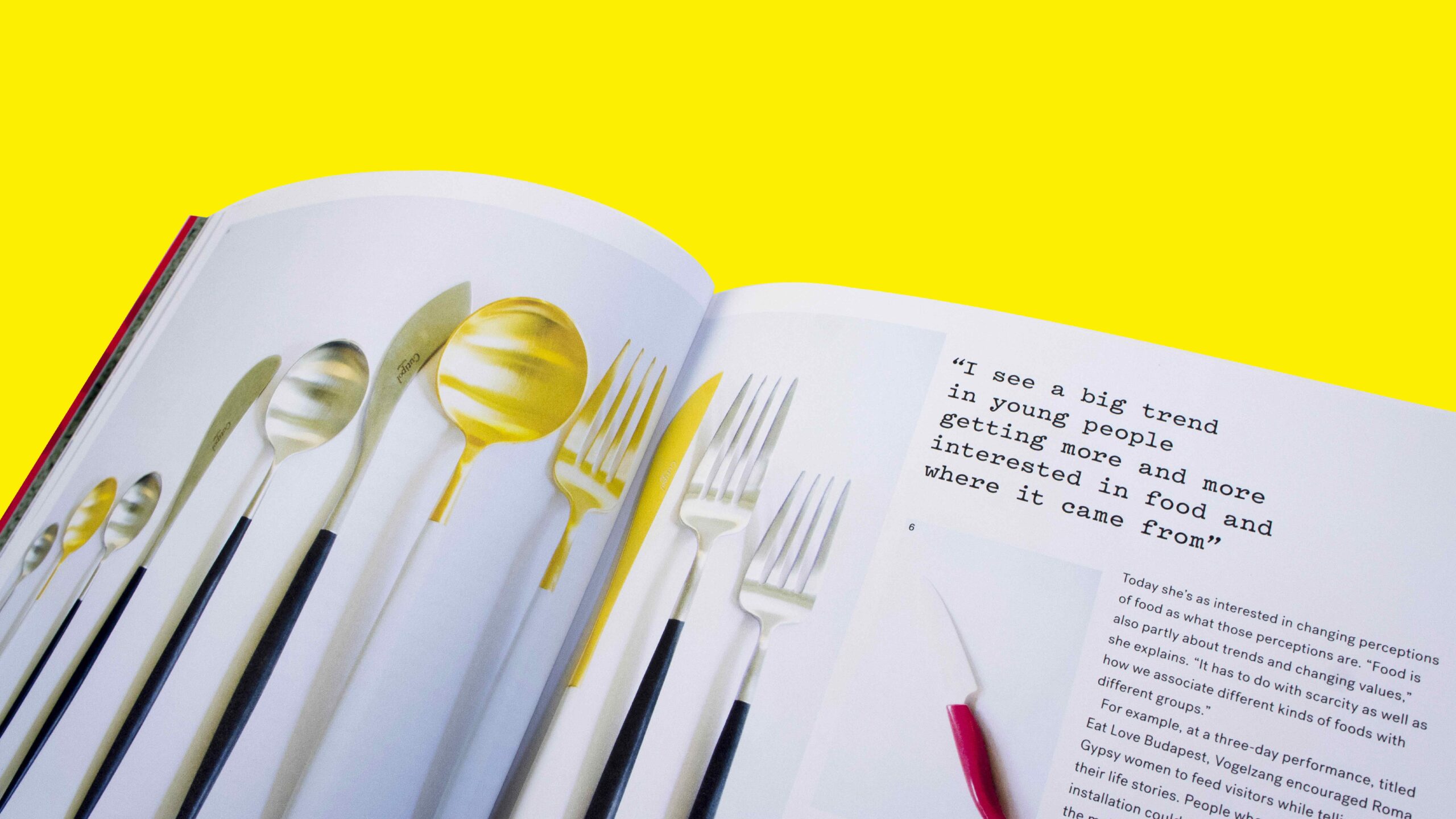
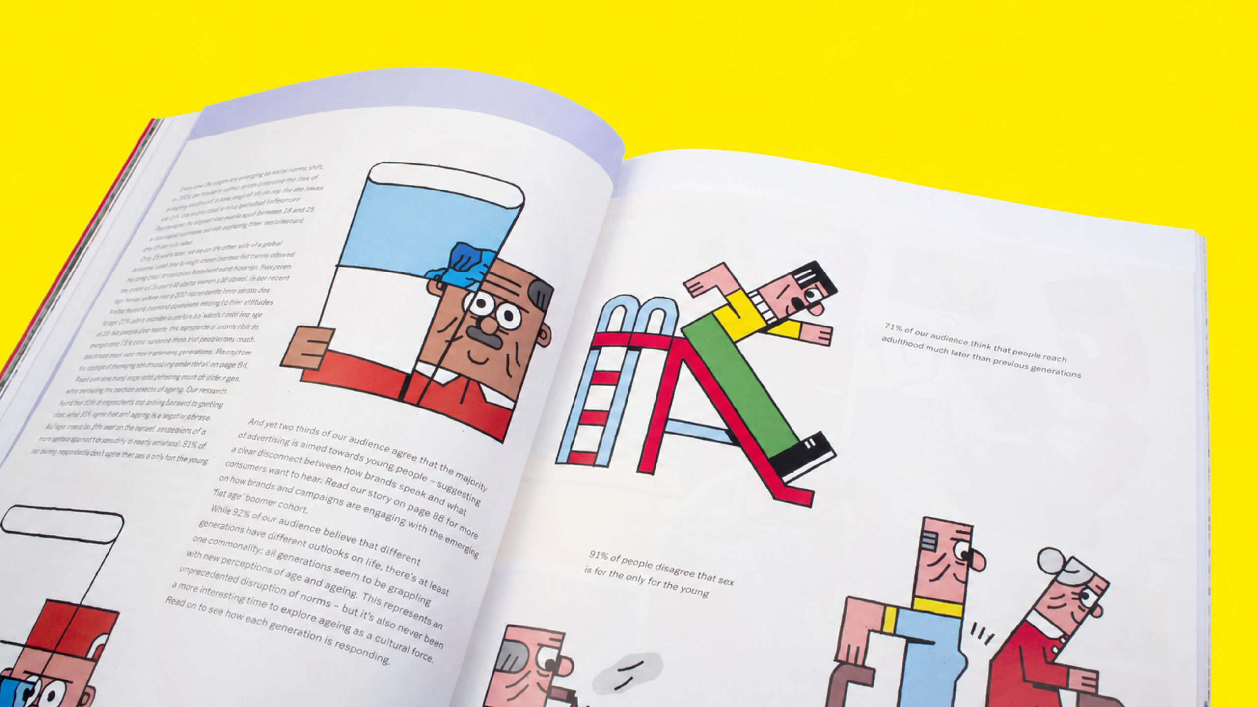
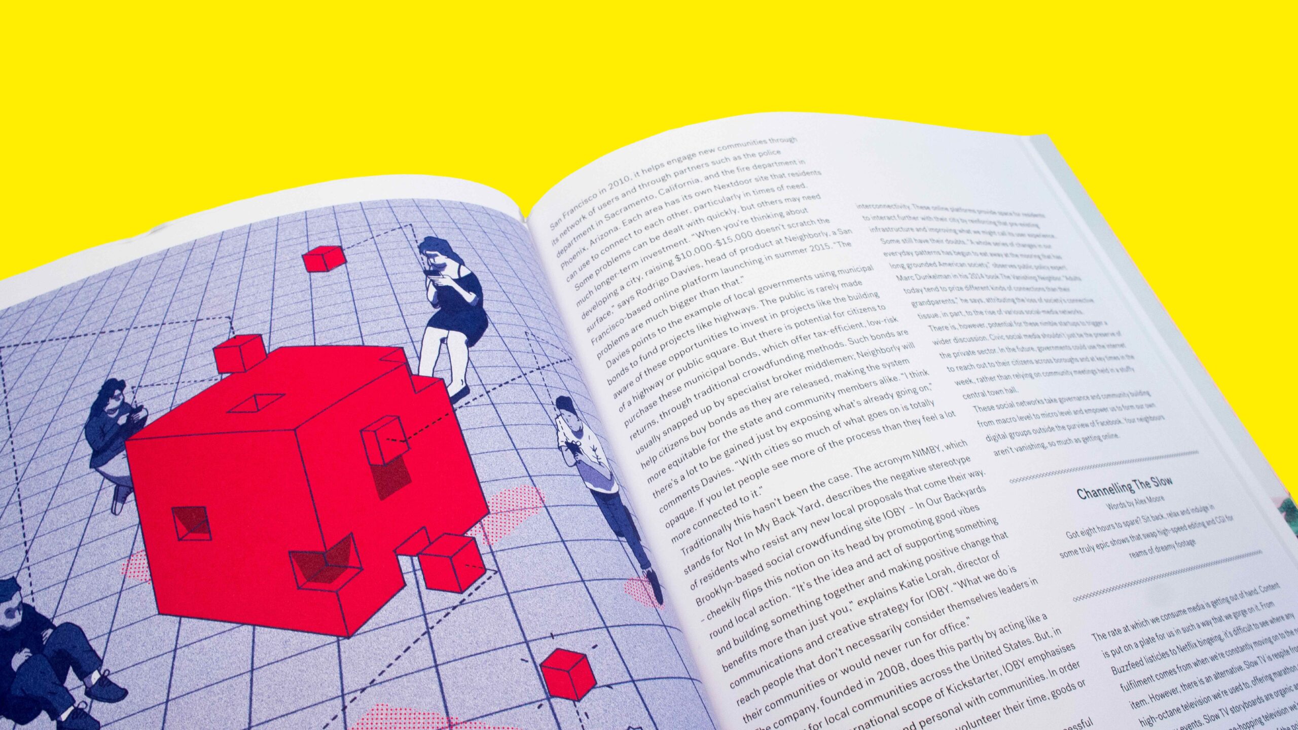
Editorial design has been a key part of my practice since my first role at Wallpaper*, where I worked alongside art director Mieron Pritchard. That experience shaped my understanding of typography, imagery and storytelling, and how individual layouts come together to create a coherent publication. It established an approach grounded in attention to detail, sensitivity to content and a strong sense of visual identity. My editorial experience also includes my role as art director at Protein magazine, where I developed these interests through a different editorial voice. Across print and digital editions, I’m interested in how design guides the reader, using hierarchy, pacing and composition to give each story its own character. My approach balances clear structure with expressive moments, allowing words and images to support one another without competing for attention. Whether through a photographic spread, a detailed feature or an interactive digital layout, the aim is to create an engaging reading experience that feels appropriate to the content. Working across these publications helped shape my wider design practice, particularly the importance of understanding a story before deciding how it should look. It’s an approach I continue to carry into my work: thoughtful, content-led design with clarity, rhythm and personality.
ART DIRECTION EDITORIAL TYPOGRAPHY VISUAL STORYTELLING
I have over ten years of experience working with a diverse range of organisations, from multinational corporations to one-person startups. Additionally, I have been an integral part of a team that has collaborated extensively with clients across various sectors, including charity, education, and beverages, to name a few. Together, we have worked on numerous projects, including high-profile design initiatives for clients such as Comic Relief and Coca-Cola.
Working as an independent design consultant, I will be in control of your project at every step of the way from concept to completion. This means you benefit from a very streamlined, extremely efficient & totally hands-on working process. In addition, I can call on a carefully selected network of experts including animators, photographers and writers to collaborate on your project. Together, we can achieve the objectives you’ve set out.
Jonmariusevans@gmail.com +44 (0) 7375406955
“Jon is a fantastic designer, I have had the pleasure of working with for the majority of my career. Not only is he a top designer but also a great guy who always receives positive feedback from clients and constantly gets rebooked! He has a wonderful proactive attitude – I cannot recommend him enough!”
JAMES CRAWFORD
FOUNDER TALENT STUDIO
“That’s great! Thanks, Jonathan We’ll definitely be in touch if we need further design help!”
RACHEL EVANS
FOUNDER STACK FOR BUSINESS
“Honestly can’t praise more highly. Jon has been super patient and agreeable to work with despite LOTS of challenging feedback and changes on this project”
AMY BERESFORD PROJECT MANAGER
TRO
“It’s been an absolute joy working with Jon. He’s a talented designer with a keen eye for detail and a knack for delivering exactly what’s needed. His proactive nature and cheerful attitude make him a real asset to any team. We wouldn’t hesitate to have him back in the future.”
BARBARA ALTOUNYAN FOUNDER FAMILY-TALK
“The team have really loved working with him!! Hes v positive, a great guy to work with along with being quick, organised, with a good eye & can work autonomously. We’ll have him back as soon as something comes up for him!”
FORPEOPLE
“Thanks Jon, you were super.”
SHAMMI UMERIA
ASSOCIATE CD
PROPHET
“Thanks Jon – it’s been a nice one! And by the way, I thought your work was outstanding – I’ve been really impressed by your approach and ability. Hopefully we’ll work together again in the very near future.”
KATHY KIELTY CREATIVE DIRECTOR
WHISLTE JACKET
“We’ve been thoroughly impressed with Jon throughout this project. His talent as a designer is clear, but it’s his efficiency, organisation, and positive outlook that really set him apart.
SAM KEISNER FOUNDING PARTNER G010X VENTURES
CLIENTS VIA AGENCIES
PLACES I HAVE WORKED
Design Studio • W&K• Landor SuperUnion • Mother • Anomaly Dusted • Curious • VCCP • Protein forpeople • TRO