At Dusted, I worked on the redesign of Equituix’s brand identity, helping to create a more confident, contemporary and distinctive visual language for a business operating in renewable energy.
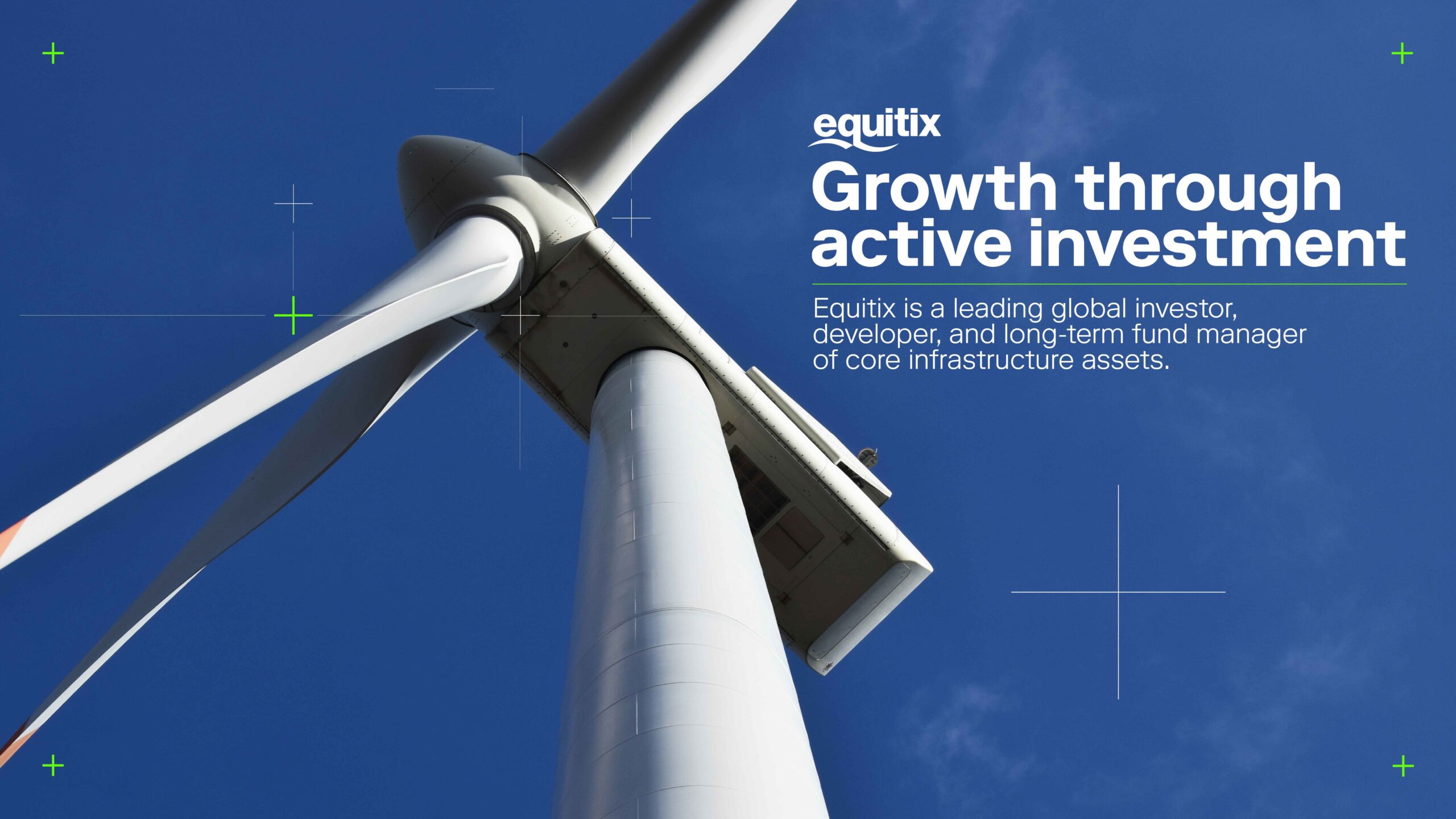
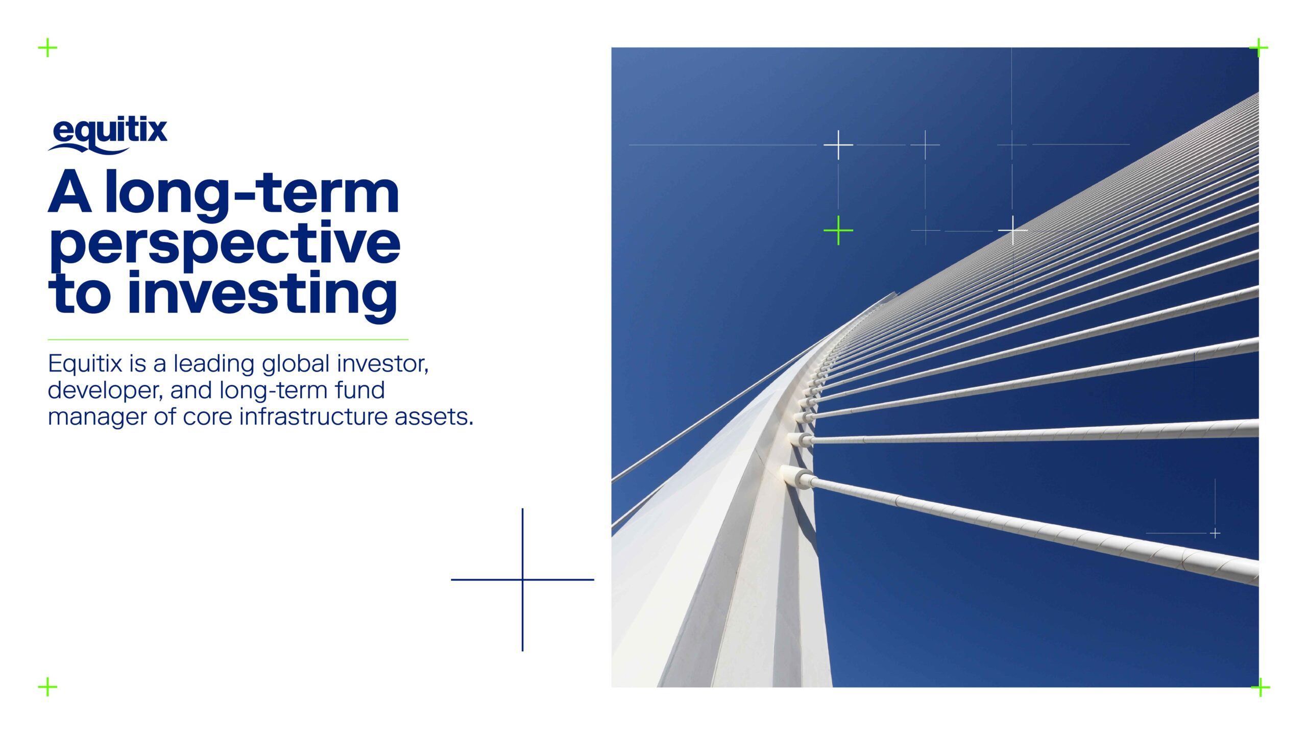
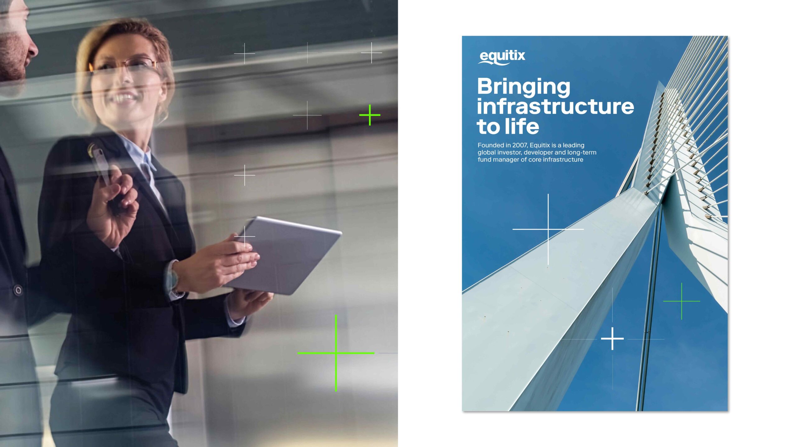
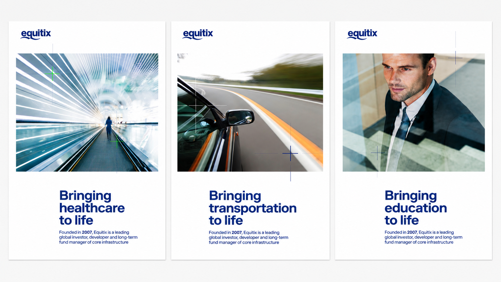
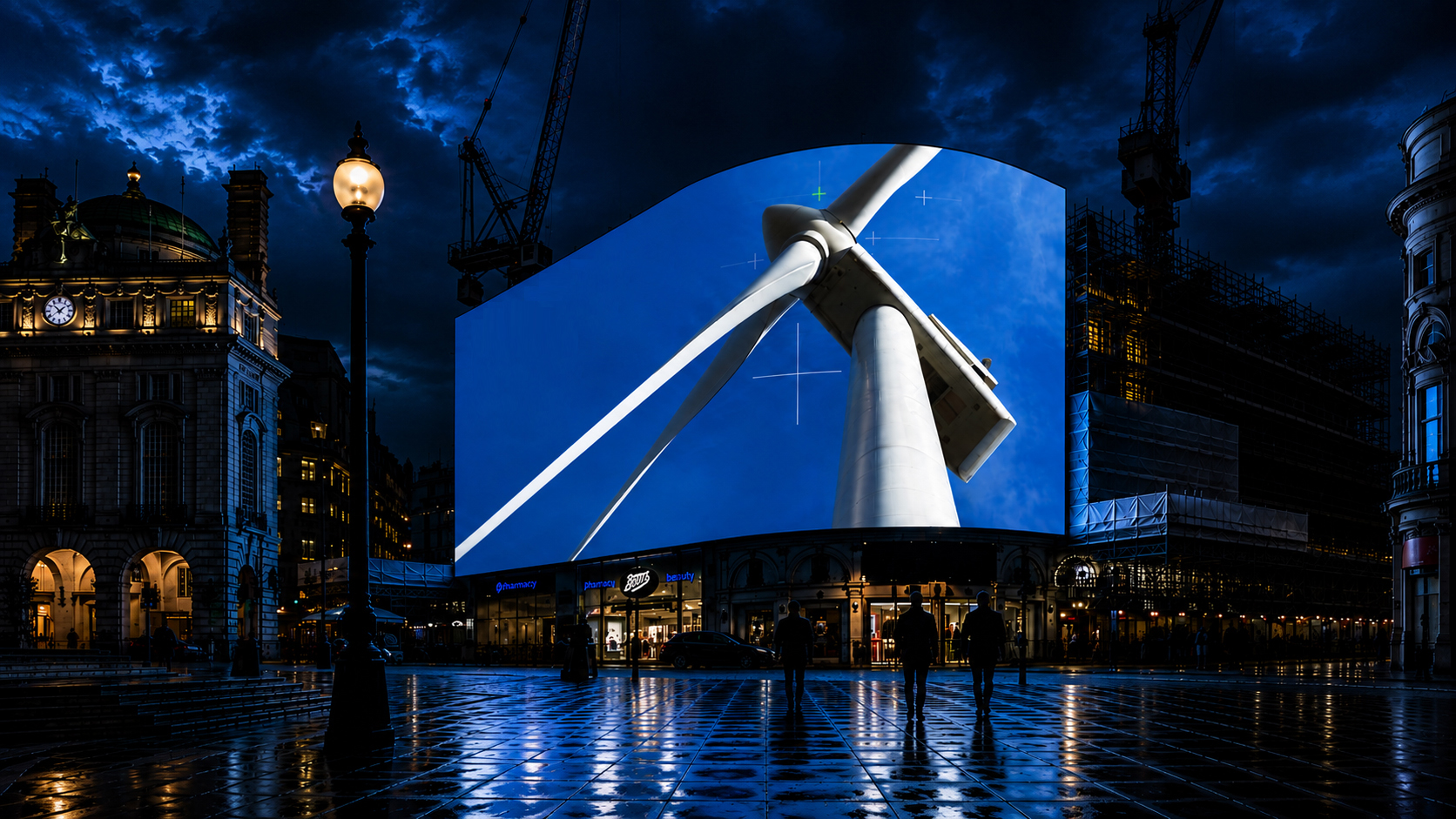
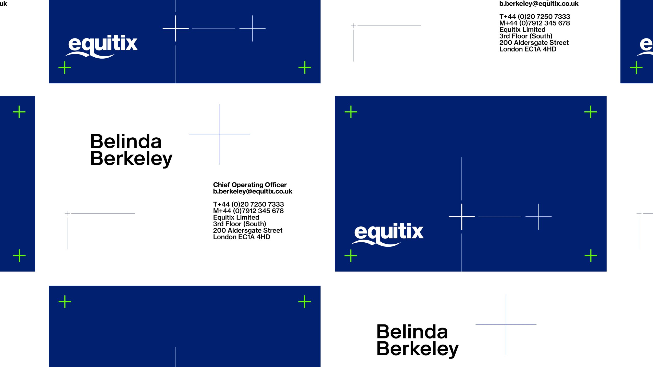
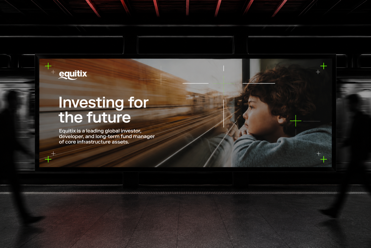
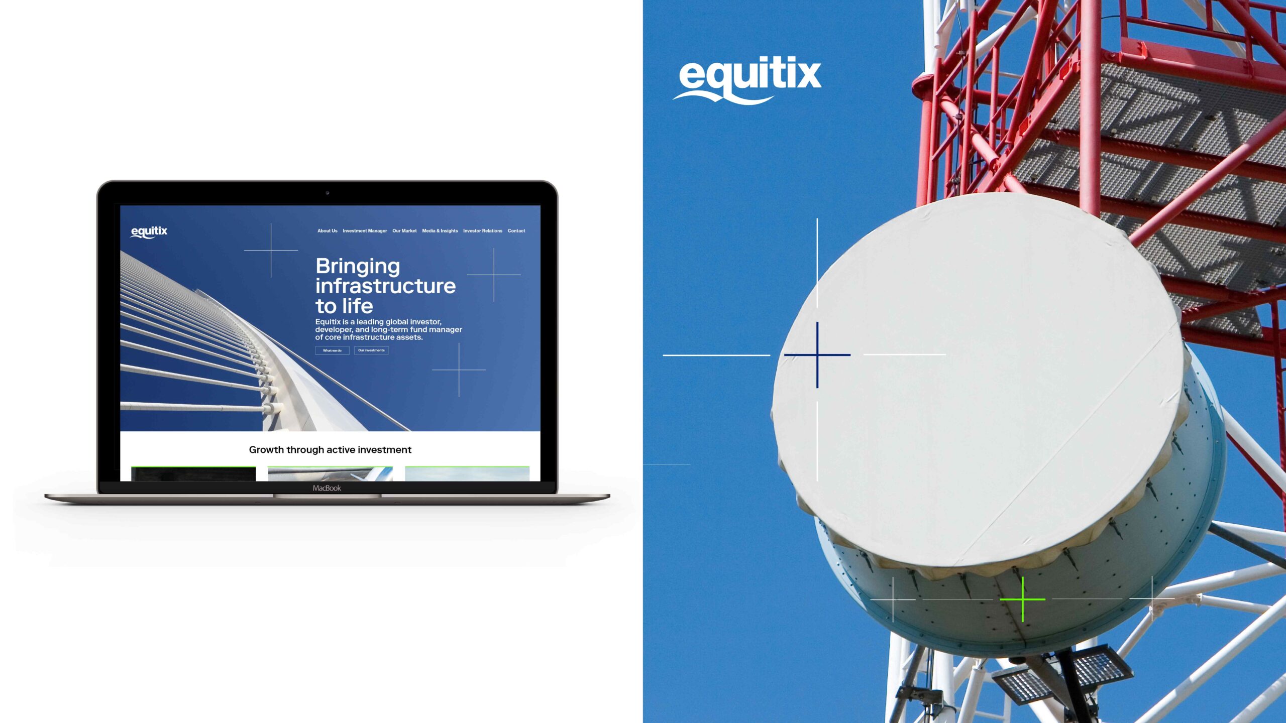
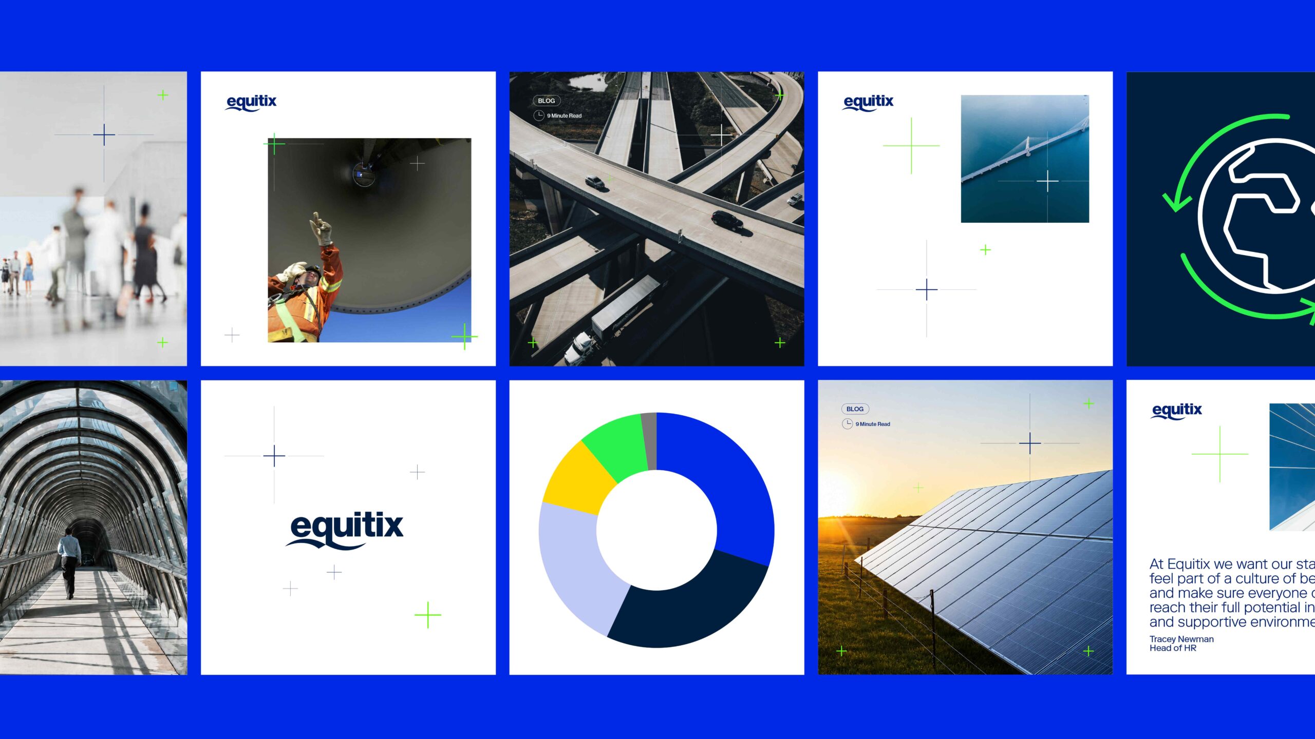
A key part of the identity was a graphical device inspired by cross-hairs. The device suggested focus, precision and direction, while also giving the brand a subtle sense of being alive with energy. It became a flexible element that could be used across different applications without overpowering the wider design system.
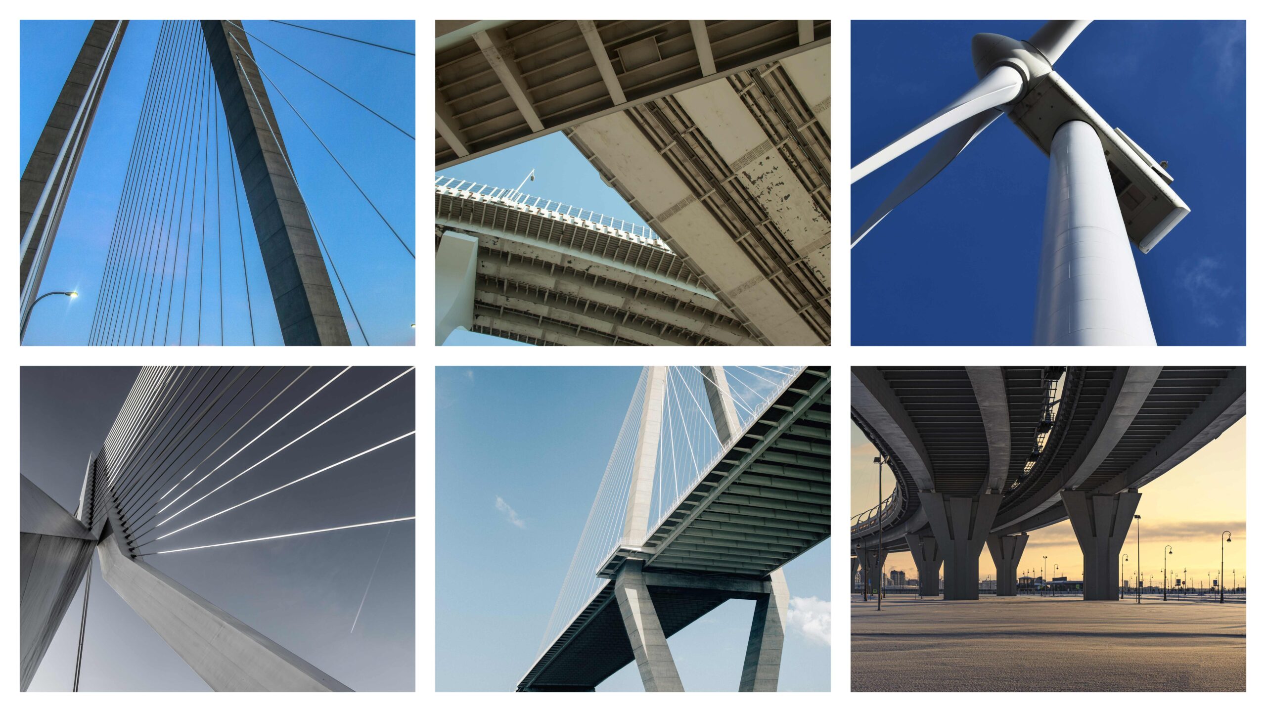
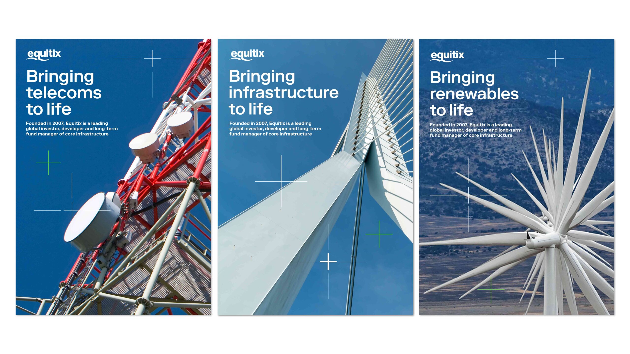
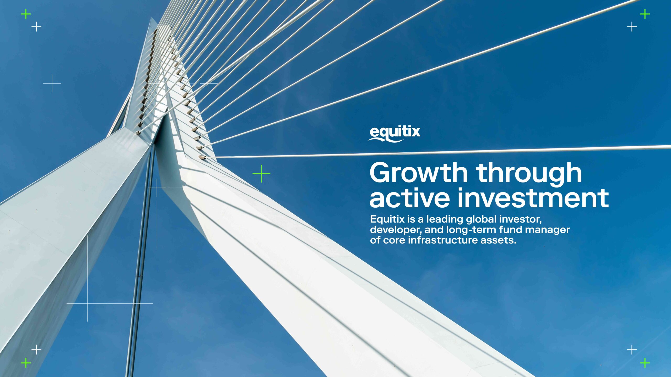
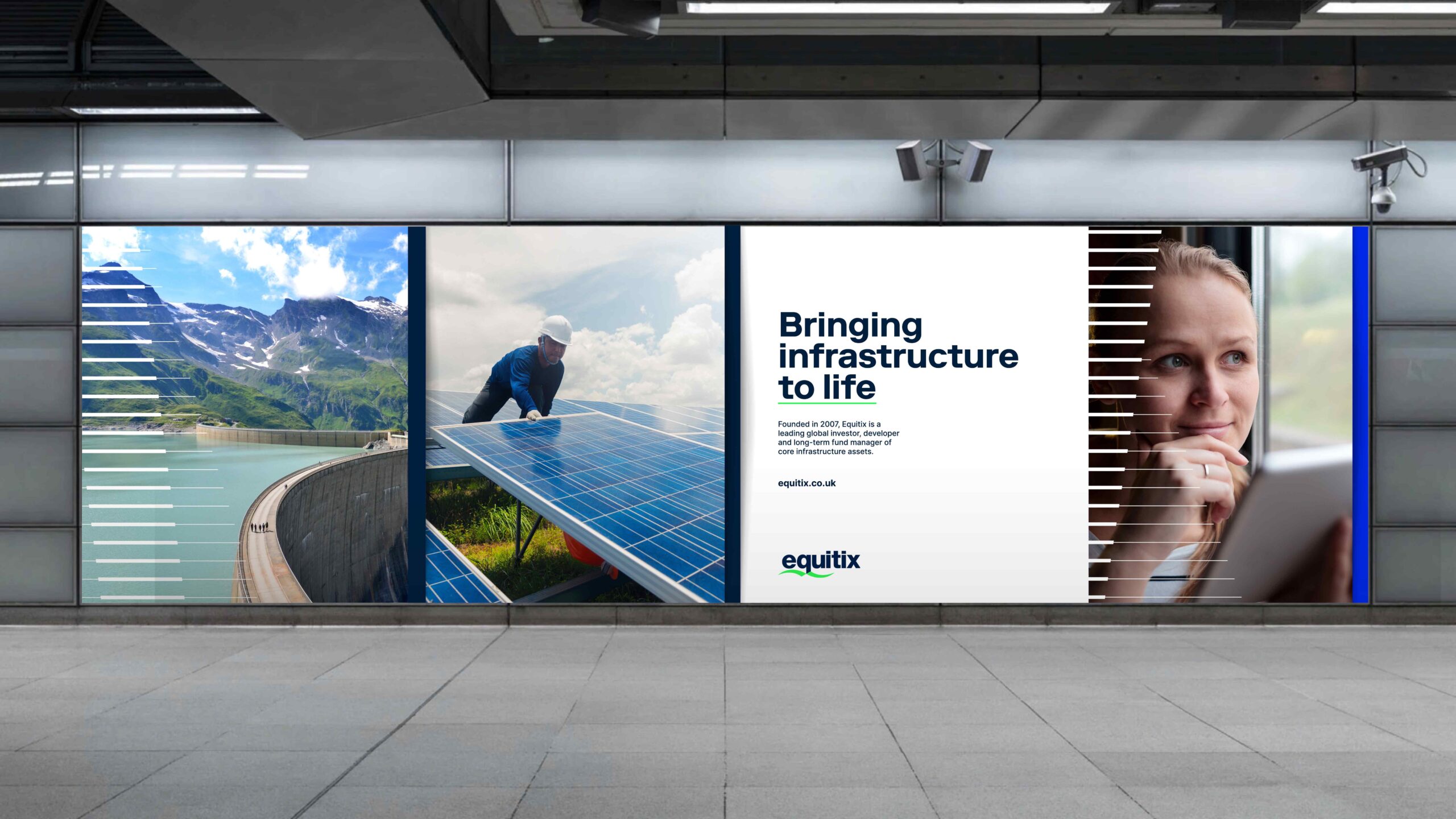
The cross-hair device was used lightly over striking photography, particularly imagery of wind turbines and renewable energy infrastructure. This allowed the photography to remain the hero, while the graphic treatment added a recognisable layer of movement, focus and energy. The contrast between expansive landscapes and the precision of the device helped give the identity a strong and ownable character.
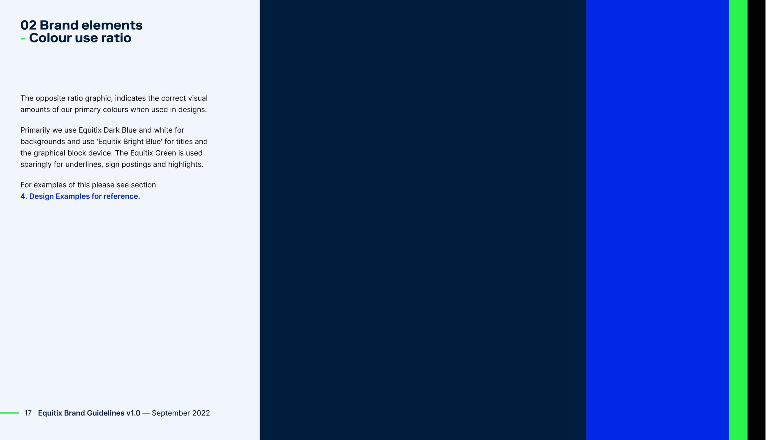
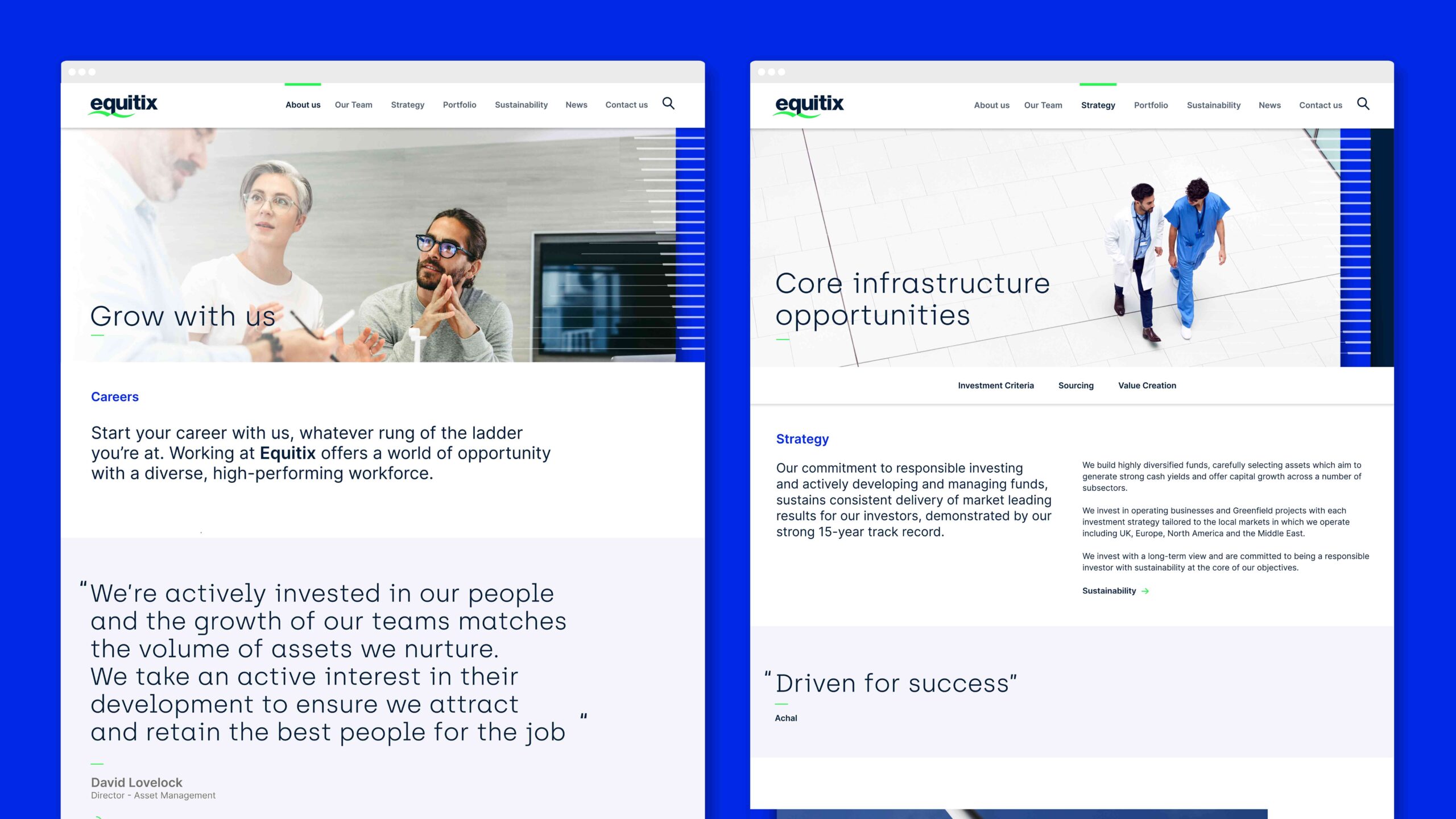
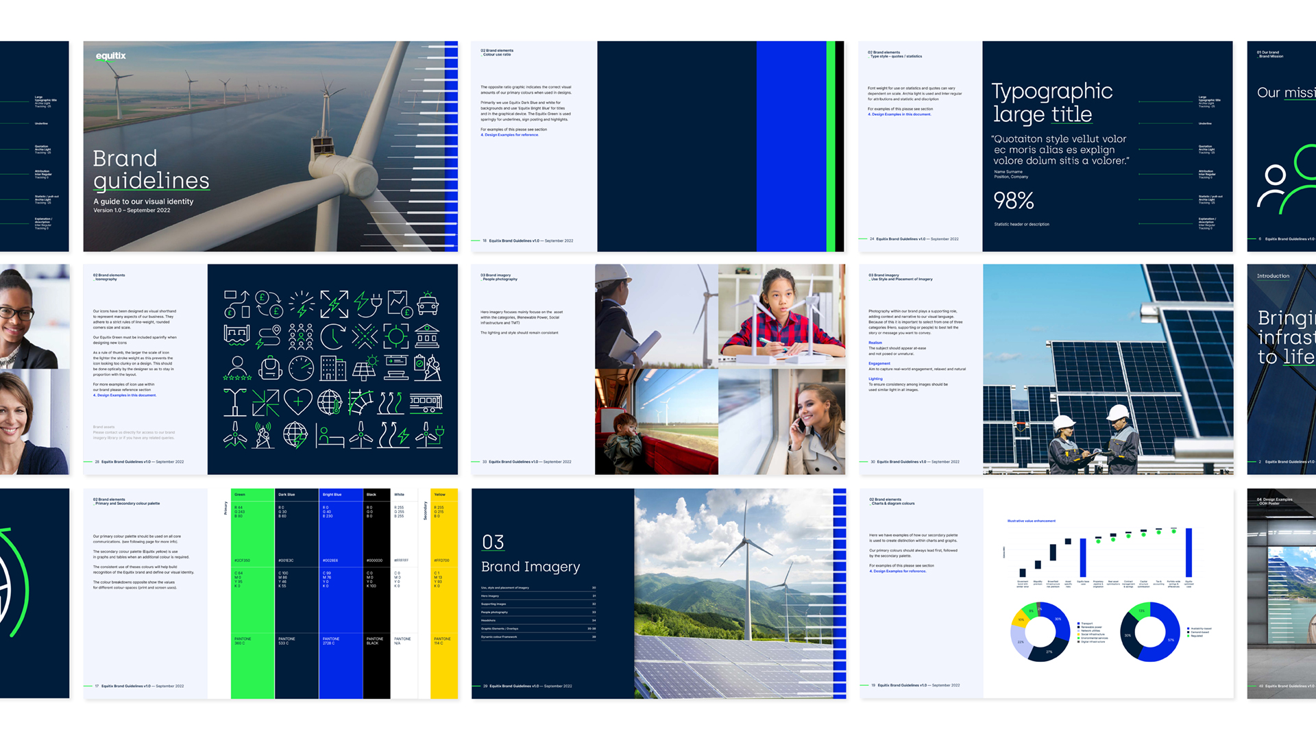
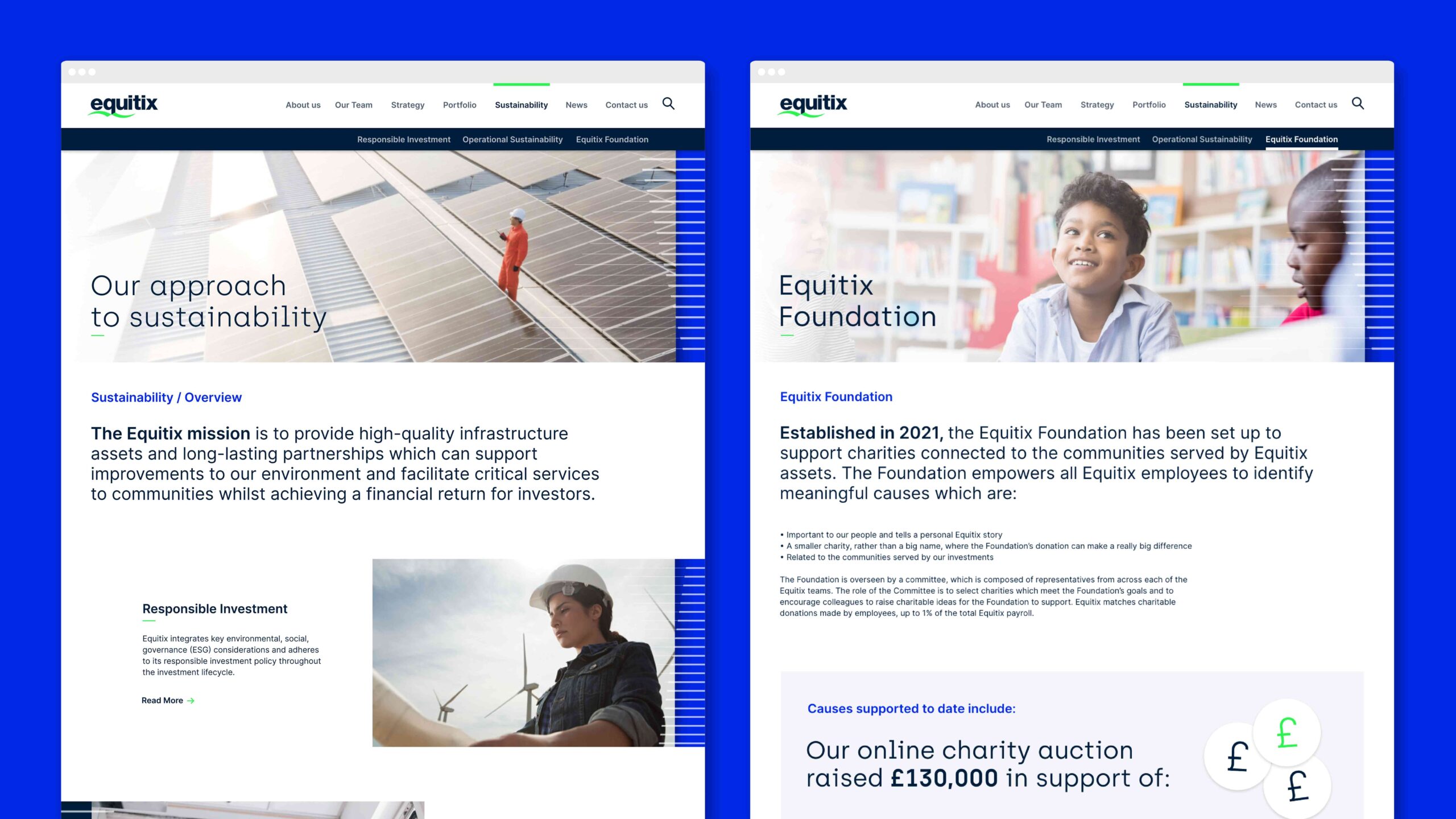
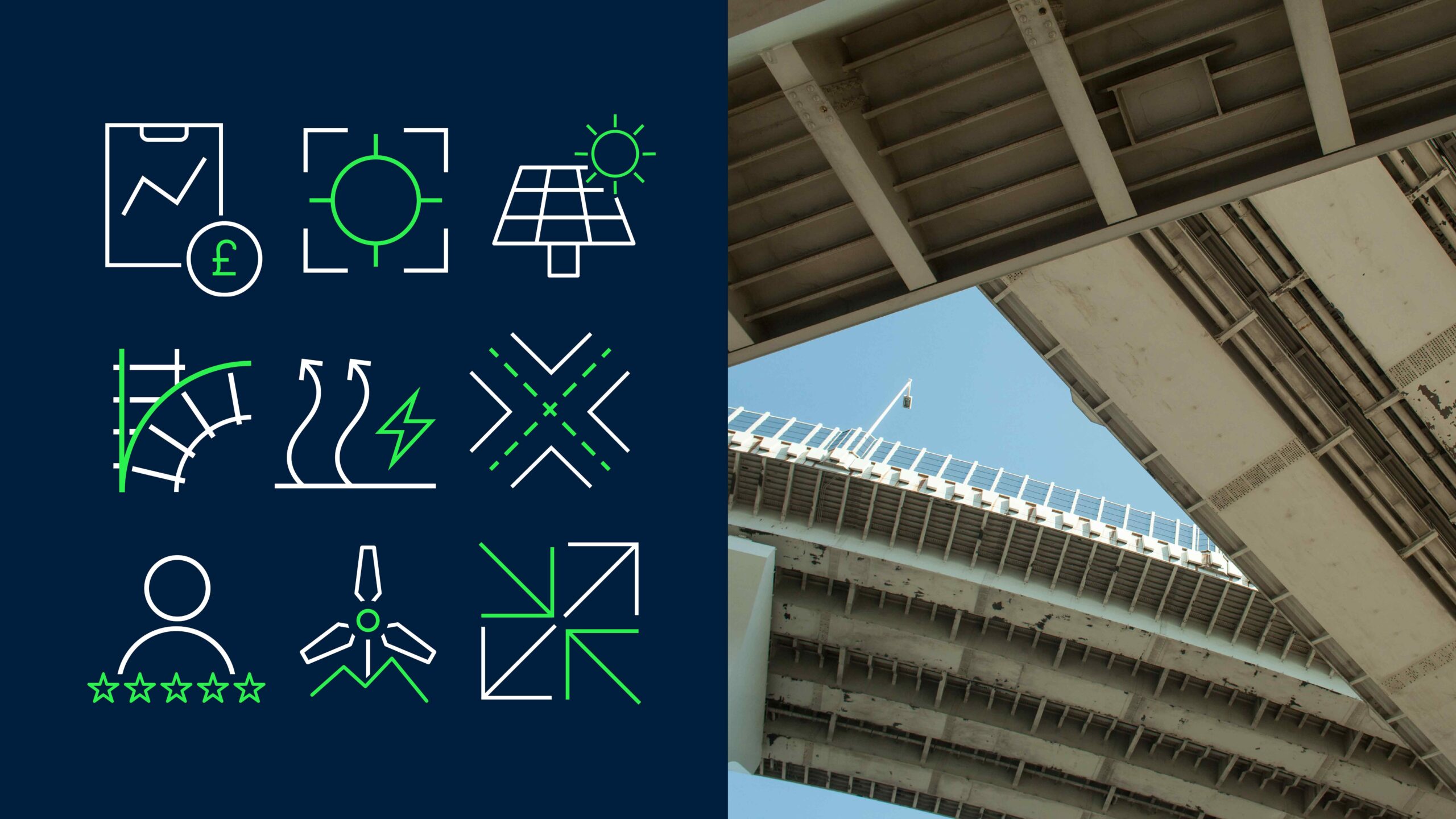
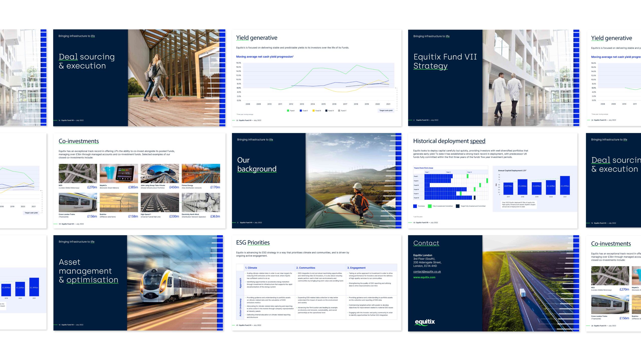
The wider system combined typography, colour, imagery and graphic elements to create a brand that felt modern, credible and adaptable. The result was an identity that communicated energy, progress and ambition, while retaining the professionalism and clarity needed for Equituix’s audience.